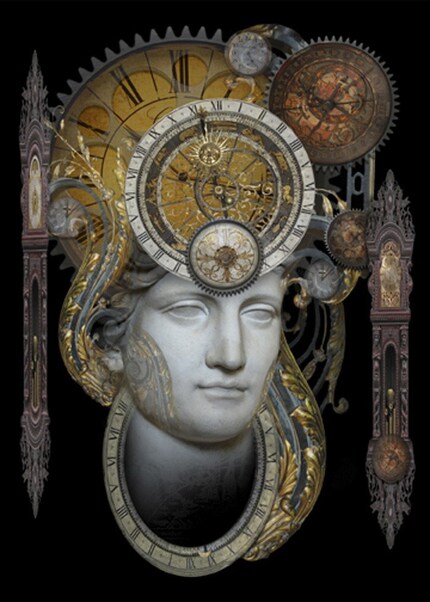
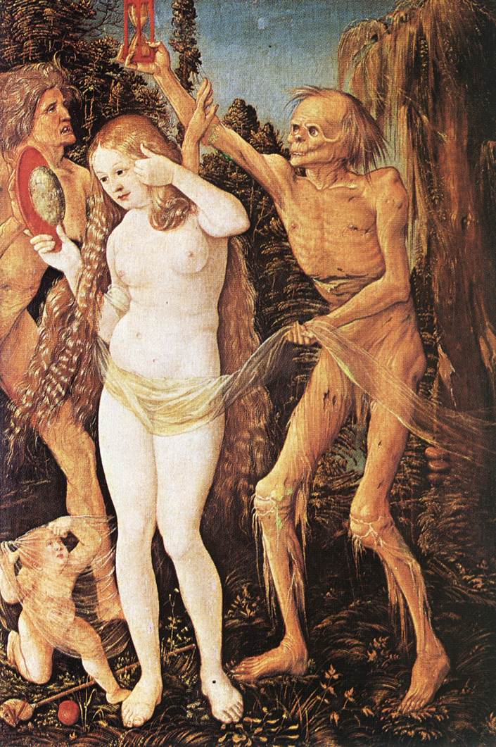
I was looking for information on how the figure of "Time" has been personified in art. Traditionally it seems to have been portrayed in either the Old Year/New Year/Father Time way, in the "Chronos, God of Time" way, or it's been wedged into the "Death and the Maiden" motif with Death holding the hourglass of life.
Here's some interesting depictions (both modern and not) of Time from my trip around the internet:
"Venus, Cupid, Folly and Time" by Angelo Brozino
"Personification of Time" by Brian Giberson
"Three Ages of Woman and Death" by Hans Baldung-Grien
Archive for November 2009
Art of CDs #1 : Paramore - Brand New Eyes
A Short Introduction:
Welcome to a feature I've been wanting to do for a while! This is "The Art of CDs" volume (volume? I doubt I'll write enough for a "volume". part, then, perhaps?) part 1! Now I know what you guys are thinking: "CDs, Jen? Really? You do realize that we have ipods and mp3s now, right?" Well, yes, of course- and don't worry I'm not behind the times... I'm very happy with my ipod, thanks, but I do still buy cds. Not excessively, but if it's a band I really like, or a few songs on one cd I enjoy, then I'd rather buy something tangible rather than digital. (Because computers crash and delete music and, let's face it, burnt cd backups start dying within a couple years.)
And there's one other reason I still buy them: the packaging. I love the little lyrics booklets and artwork. Well done cd packaging gives you an entire album in a nutshell, really. (Well, at least the innovative ones do. There are many that just slap a picture of the artist's face on the front and call it a day.)
But I'm sure you've had enough rambling now and are ready for some content! Shall we get started?
The Art of CDs 1:
Artist: Paramore
Album: Brand New Eyes
Released: Sept. 2009
Acquired: early Oct. 2009
Reason for buying: I'm only a casual Paramore fan (ie- I have their last cd, but never really felt the need to search out their back catalog), but after hearing "Decode" and "Ignorance" on the local rock station and finding them to be really catchy and fun, I decided to give the album a listen.
Packaging:
The album itself is gorgeously designed. The lyric booklet makes particularly interesting use of photography and typography. Very well designed, in my opinion.
Images:
^The Cover.
^Back Cover and Track Listing. Nice use of the empty picture frames. (Are empty picture frames the ones that are supposed to be haunted? I can't remember... there's some kind of ghost story dealing with them...)
^The full package. CD art mirrors the cover art, black booklet back offsets the black and white photography on the inlay.
^Inside the booklet. Sorry I don't have more images of inside- my camera isn't the greatest and the rest came out a bit blurry.
Overall Opinion: I love the packaging! The CD? Well, I've found my biggest problem with this band is that their songs run together and start to sound the same to me. I really like about 3 or 4 songs, though, and maybe if I put my ipod on shuffle and hear the other songs out-of-context, I'll start liking more.
Update November 2009: Finally got a chance to listen to the songs more and I'm going to say it's much more enjoyable on subsequent listens. I'm particularly liking how they've seemed to add in more of the male backup-vocals (sorry, I'm horrible at remembering who's-who). Personal favorites from the album include Brick by Boring Brick, Decode and Ignorance, among others.
What's Next in Part 2? Next time I'll do a review of the new cd by one of my absolute favorite bands (I think if you've liked a band consistently for at least 6 years, that qualifies as "favorite", right? :P) that I finally picked up yesterday. So look out for that next time on "The Art of CDs". ;)